Draying.io Logistics Platform Redesign
Redesigning a drayage logistics platform to simplify container management and streamline operational workflows.
Client
- UI/UX Designer
- Design System Designer
My Role
- User Flows
- High-fidelity App Designs
- Website Design
- Email Templates
- Design System
Deliverables
- From: July 2023
- To: November 2023
Timeline

About Project
Trophy Games is a Copenhagen-based studio known for building management and strategy games. Their titles focus on realistic systems, accessible gameplay, and long-term progression that keeps players engaged.
As part of our collaboration, I worked on designing their new mobile game Truck Manager — a transport-management simulator where players grow and run their own trucking company. My role was to shape the core user experience by designing key screens, flows, and systems that support intuitive gameplay, clear information, and smooth player progression.
Challenges
Because Truck Manager is a simulation game, it contains a large amount of data, tables, statistics, and reports that make the gameplay feel realistic. The main challenge was to present this complex information in a way that feels clear, lightweight, and still playful.
An additional task was to guide players through many different actions, such as upgrading trucks, planning routes, and managing finances, without overwhelming them. Designing user flows that feel simple and intuitive was essential for maintaining player engagement.
Key challenges included:
Data Complexity
Large datasets required clearer structure.
Feature Integration
New functionality needed to fit seamlessly into the system.
Inefficient User Flows
Key actions required too many steps to complete.
Inconsistent UI
Lack of unified design patterns across the product.
Start of the Product Redesign
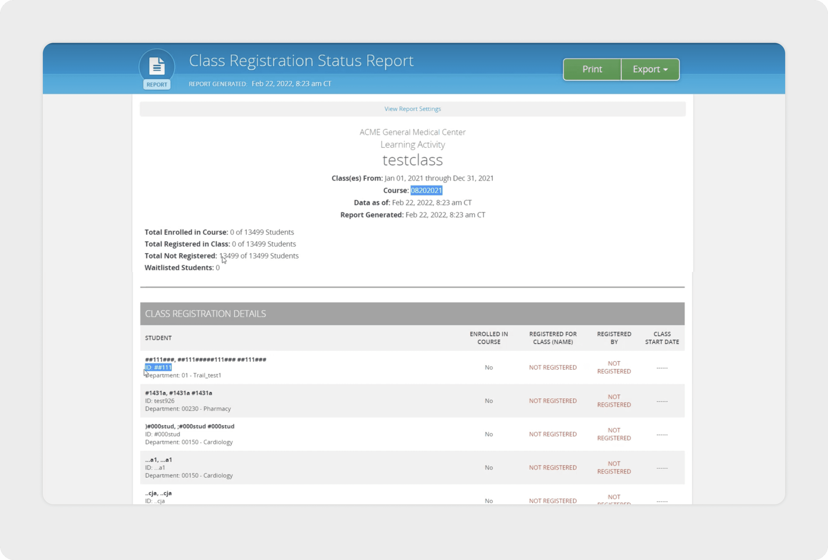
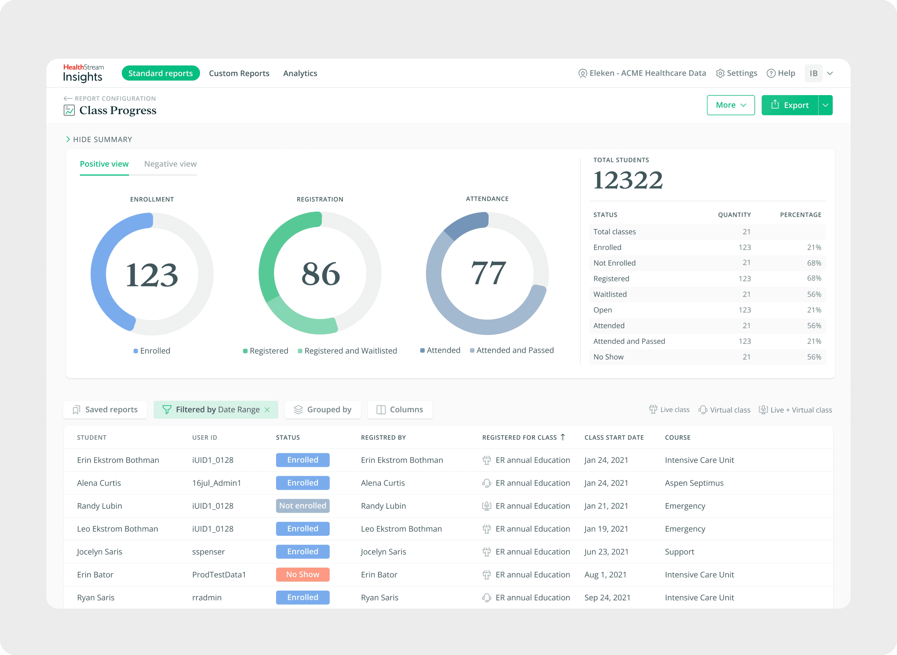
One of the main focus areas during the collaboration was the “To Dispatch” tab, since clients described it as the most overwhelming part of the system. The page contained a dense amount of shipment data, repeated elements, and filters that were difficult to navigate. This made daily dispatching tasks slower and more error-prone.
Here are the main improvements I introduced during the redesign:
Improved information hierarchy: I reorganized the layout so the key data such as the DO number, container status, dates, and carrier details stands out clearly. Secondary details were visually toned down to reduce noise and make scanning easier.
Simplified filters and sorting: I restructured the filters and sorting controls so they are easier to find and use. This helped reduce visual clutter and made the interface feel more organized and less overwhelming.
Redesigned action buttons: I restructured the filters and sorting controls so they are easier to find and use. This helped reduce visual clutter and made the interface feel more organized and less overwhelming.
Unified status badges: Status indicators like Imp, Live, OW, and AV had inconsistent styling. I redesigned them into a unified badge system so users can recognize statuses quickly and confidently.
Sidebar for Additional Tools
This tab includes several important tools — a chat for communication between users, private notes, and detailed order information. In the previous design, these elements were mixed directly into the main screen, adding even more clutter to an already overloaded interface.
To keep the table clean and prevent information overload, I moved these features into a contextual sidebar. The sidebar opens only when the user clicks a dedicated button, allowing them to view extra information without interrupting their workflow. This solution keeps the primary table focused and easy to scan, while still giving users quick access to all necessary details when needed.

Create Order Flow
The Create Order flow was another area that required simplification. My goal was to make the process more structured and intuitive by breaking it into clear, manageable sections. Users can configure container details, select terminals, add stops, and attach notes without feeling overwhelmed. Once the setup is complete, they can compare delivery options with transparent pricing, capacity information, and availability. This helps dispatchers make faster and more confident decisions.


Group Location Settings
The Group Location Settings feature allows users to organize pickup and delivery areas into logical groups. In the previous design, it was difficult to understand which zip codes belonged to each zone and to adjust them efficiently.
I redesigned the flow into three clear parts: a group list for navigation, a table showing selected zip codes, and an interactive map for visual confirmation. This structure makes it easier to review service areas, edit zones, and manage large geographic regions without confusion.

UI Kit
During the collaboration, I also created a UI Kit to bring consistency to the product and organize all components into one clear system.
Because the product focuses on precise data, the visual style stays clean and minimal. The goal was to make information easy to read and avoid any distracting decorative elements.

Website & Email Templates
In the final stage of the project, my work expanded beyond the product interface. The client asked to redesign the marketing website and create a set of email templates that would match the updated product style.
The goal was to keep everything clean, simple, and aligned with the new visual system so all digital touchpoints felt consistent. I applied the updated colors, typography, and component style to the website and emails, creating a unified experience across the entire brand.


Anna was very proficient and professional, we did extensive and detailed work over every single flow and screen. Everything was delivered on time and properly