HealthStream Reporting Redesign
Redesigning a healthcare reporting tool to simplify compliance tracking and certification management.
Client
- UI/UX Designer
- Design System Designer
My Role
- User research
- High Fidelity Designs
- Interactive Prototype
- Design System
Deliverables
- From: February 2022
- To: October 2022
Timeline
About Project
HealthStream is a leading provider of workforce development and compliance solutions, trusted by over 4,000 healthcare organizations and more than 70% of U.S. hospitals. Their platform helps ensure staff keep up with certifications, training, and licenses required for safe, high-quality care.
At the center of this platform is the reporting tool, which administrators rely on to track compliance across entire organizations. While it had supported hospitals for over 15 years, it had not been significantly updated. HealthStream recognized the need to modernize this critical feature to better meet customer needs and maintain its position as a market leader.
Challenges
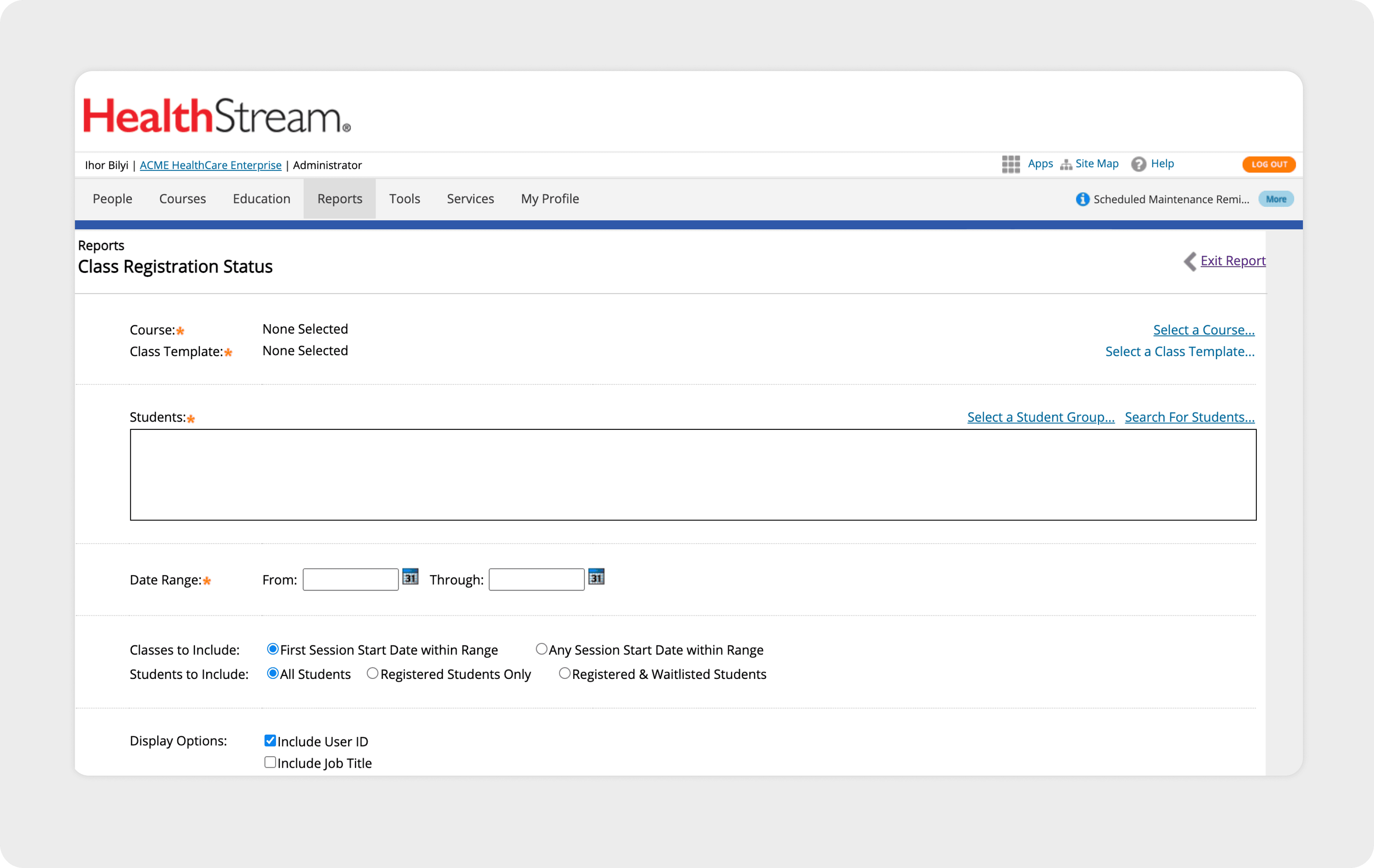
To respond to customer feedback, HealthStream introduced a new feature called Custom Reports. The vision was to give administrators complete control over how their reports were structured — tailoring every detail to create a perfectly personalized output.
However, research showed that the reality didn’t always match the intention. For many users, the extensive customization options added complexity rather than clarity. Instead of saving time, administrators found themselves navigating a tool that felt heavy and overwhelming.
Key challenges included:
Complex Workflows
Generating a report often took more steps than expected.
Navigation Hurdles
Users struggled to find the right templates or datasets.
High Customization Load
Too many options created unnecessary complexity.
Information Overload
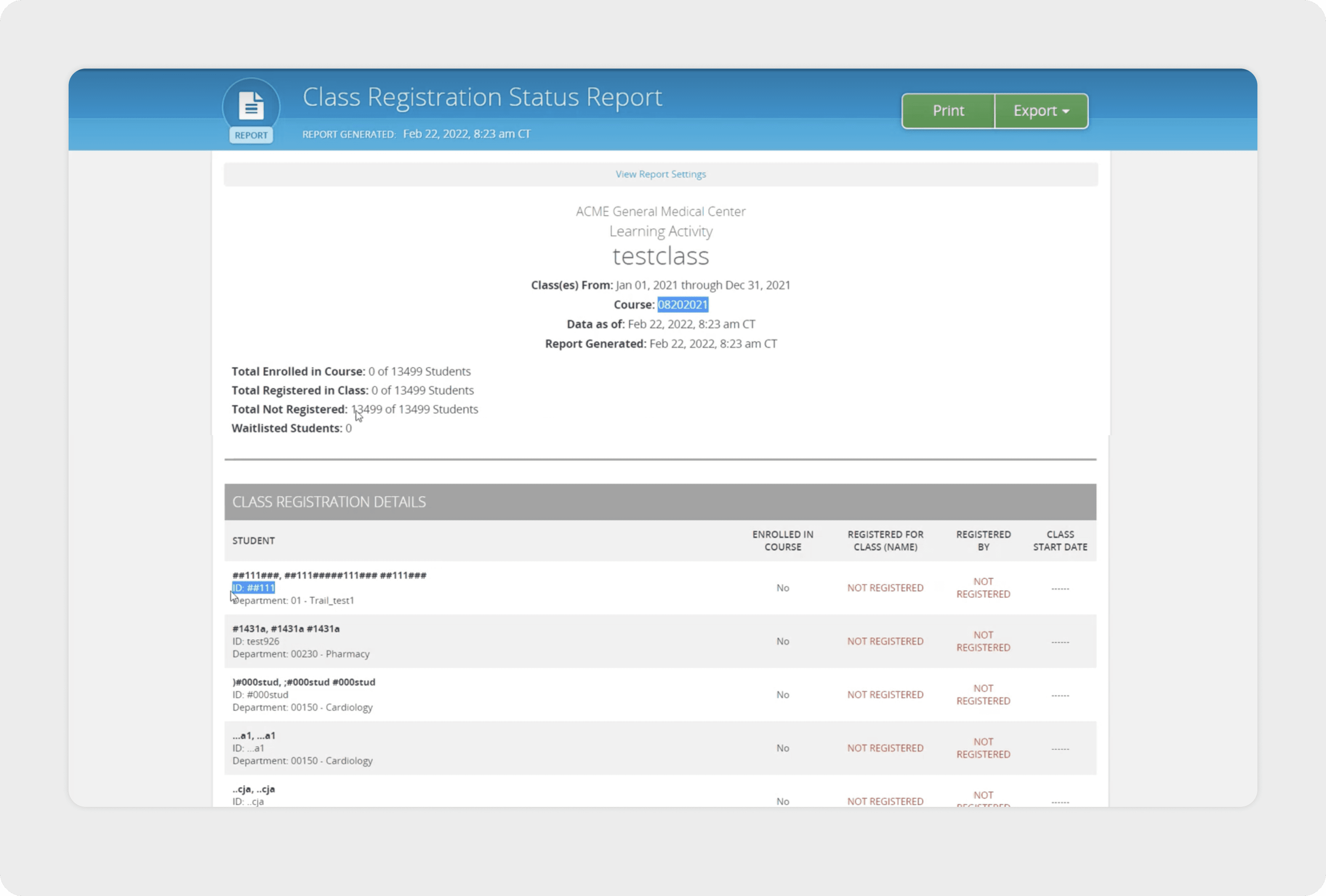
Large tables made it hard to spot important compliance figures.
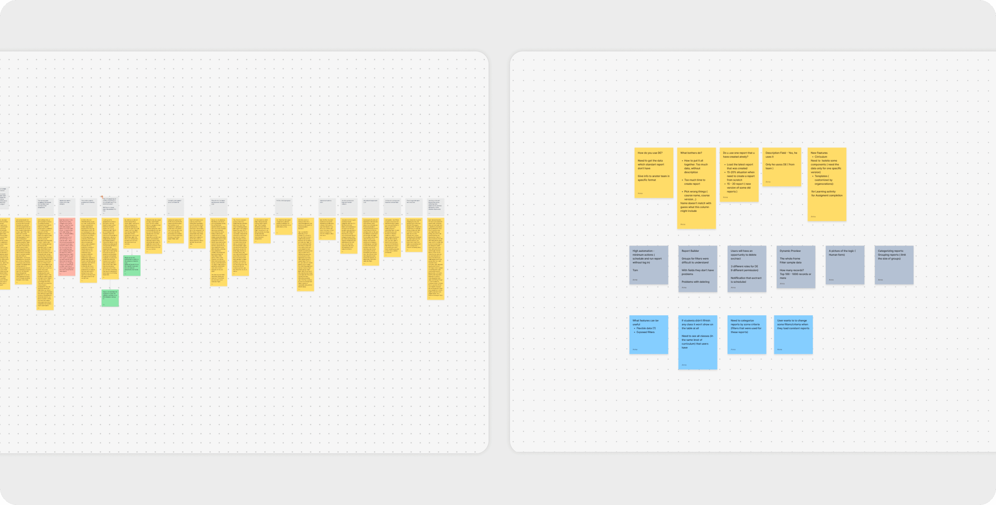
User Research
To understand how administrators worked with the reporting tool, I conducted interviews with hospital staff and complemented those insights with input from HealthStream’s support team. This gave me both the user’s perspective and the team’s long-term view of common issues.
A clear pattern emerged:When standard reports didn’t provide the full dataset, administrators often resorted to downloading multiple reports and manually merging them in spreadsheets. This extra step was not only inefficient but also introduced risks of error — hardly ideal when managing compliance for hundreds or even thousands of employees.
The earlier Custom Reports feature had aimed to solve this, but user feedback showed that the added flexibility actually slowed people down. What administrators really wanted was simple, trustworthy standard reports with just a bit of flexibility — not dozens of customization options.
Research revealed that customers didn’t need highly customized reports — what they wanted was a standard report with just a little flexibility.
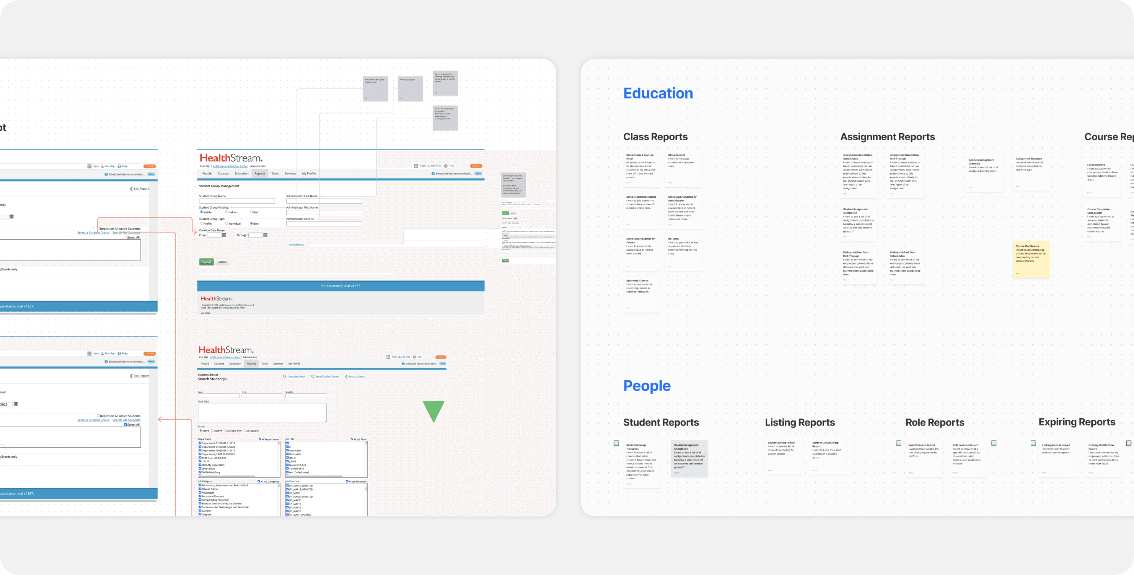
Product Analysis
Before starting the redesign, my design partner and I conducted a full analysis of the product. We reviewed existing report types and collaborated with both the support team and clients to better understand how the reporting tool was being used in practice.
Aprroach & Results
During this project, I focused on redesigning the report templates. My main goals were to make reports more flexible to create and configure, while also improving the user flow so administrators could work faster and more efficiently.
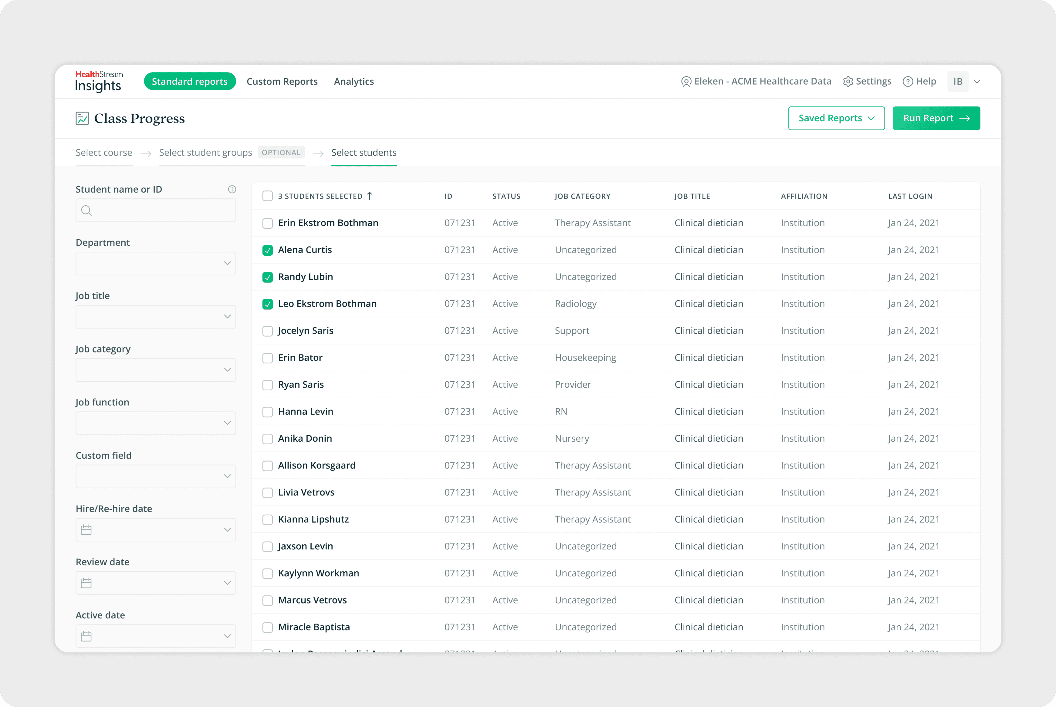
The first area I tackled was the report setup screen, with particular attention to the filters. Filters are the foundation of every report — they determine which employees, courses, or certifications are included. By improving the filter experience, I aimed to make it easier for users to navigate large datasets and generate accurate reports without unnecessary effort.
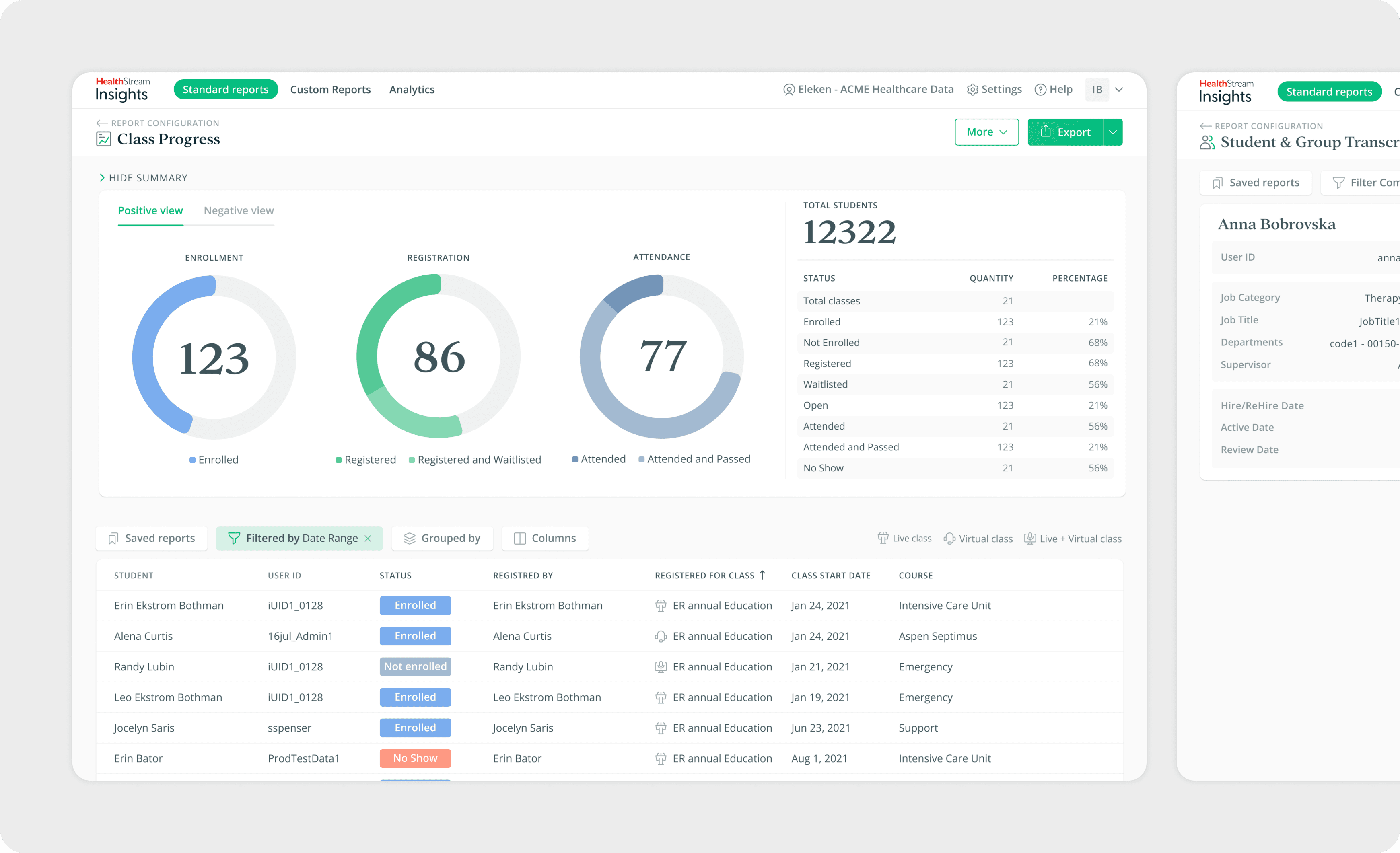
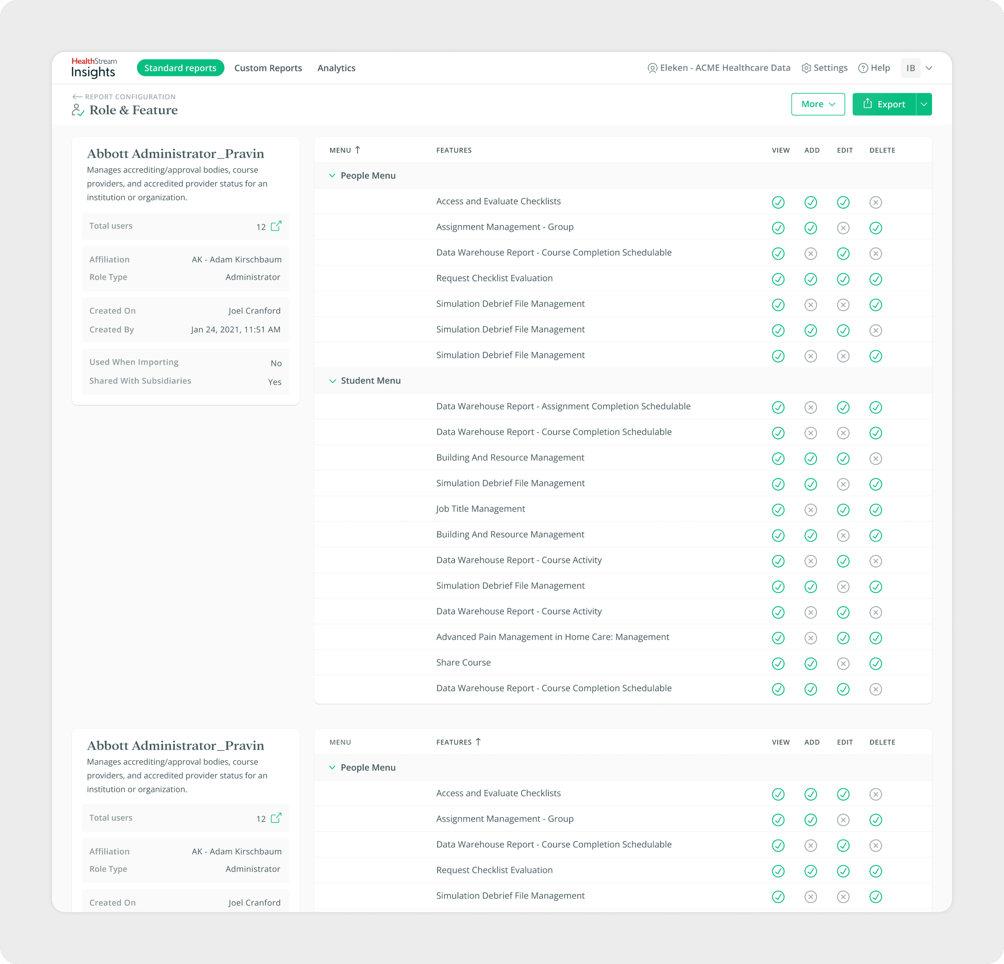
Report Page
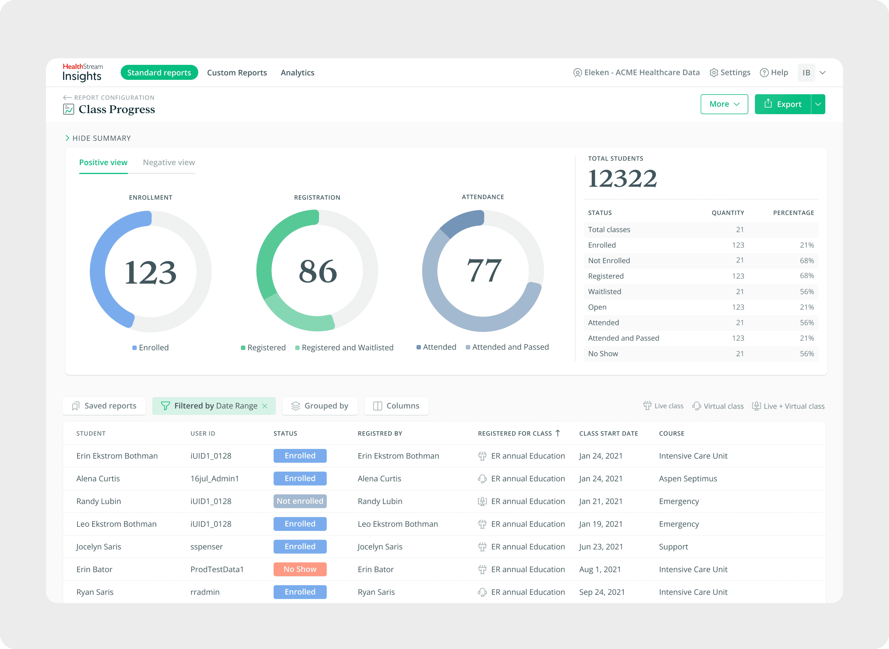
One of the most important parts of the redesign was the report page itself. Previously, reports were displayed in large tables that made it difficult for administrators to quickly identify important information. To make insights clearer, I redesigned the layout so that key figures appear at the top of the page, highlighted with larger, more visible formatting. This change allows users to see the overall status of their data at a glance before diving into detailed tables.
In addition, the report page was enhanced with filters, grouping, and column editing. Together, these features make reports much more flexible: administrators can refine data with filters, organize information through grouping, and adjust columns to display only what matters. This enables them to quickly adapt a template and configure reports to fit different situations with ease.
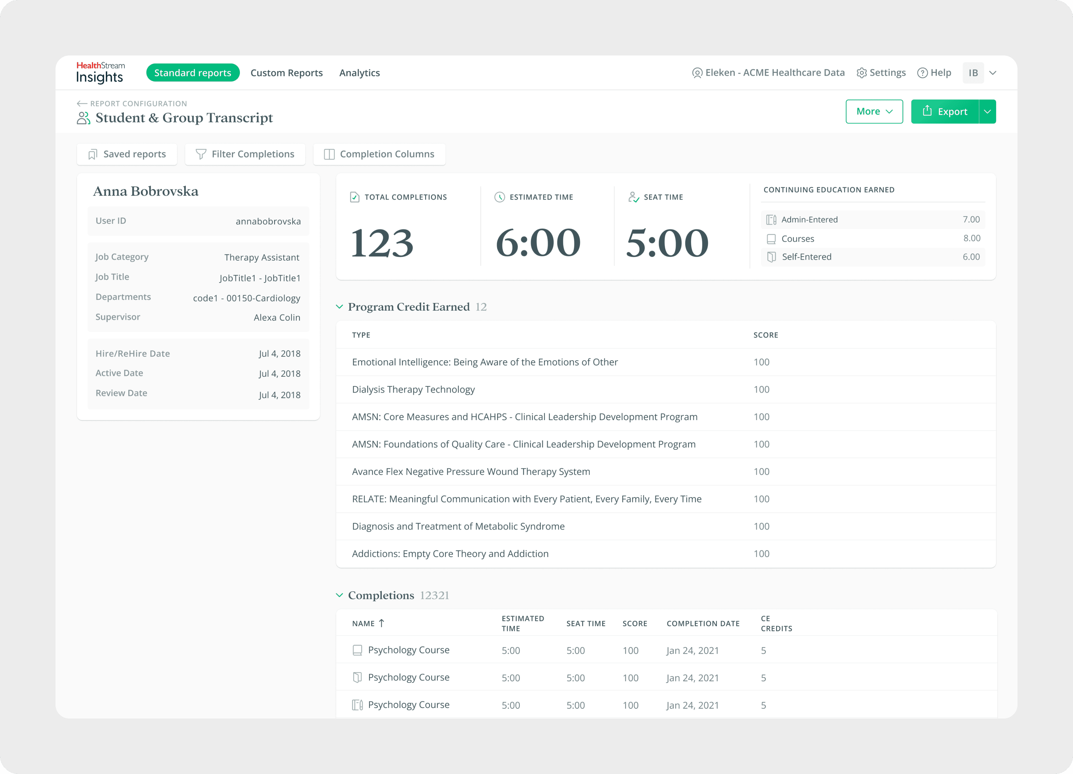
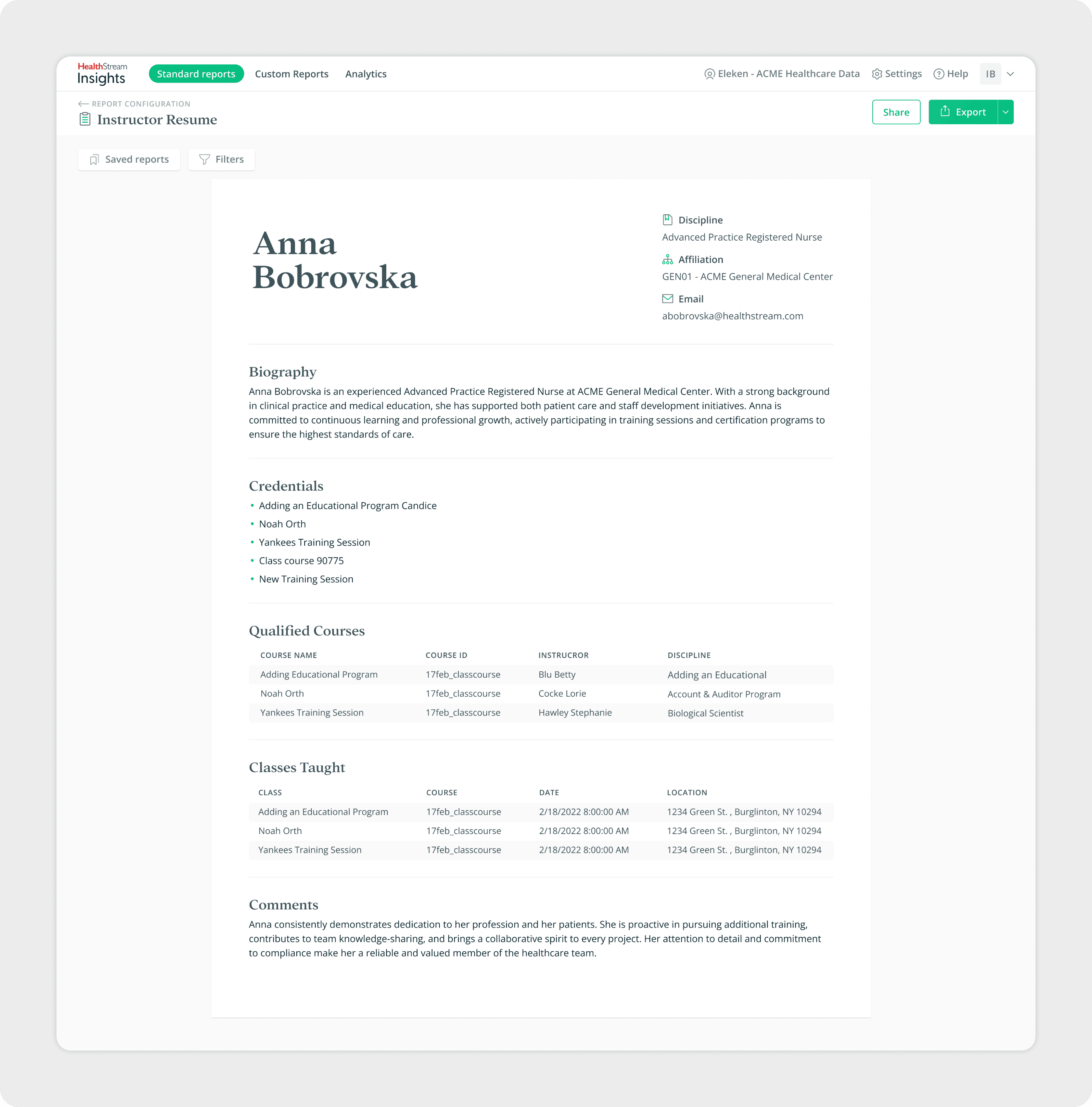
Variety of Reports
The Healthcare Reporting Tool supports a wide range of report templates, each designed for different administrative needs. My goal was to create a clear structure for presenting data across these diverse formats - from high-level resumes and instructor profiles to department-level overviews and course completions.
Testing
During the design process, my design partner and I conducted interviews and usability testing sessions with HealthStream users. We presented different versions of report templates and user flows, gathering feedback on clarity, navigation, and efficiency.
This ongoing testing helped us confirm that the redesign directly addressed past pain points, improved the reporting flow, and supported administrators in working more efficiently.
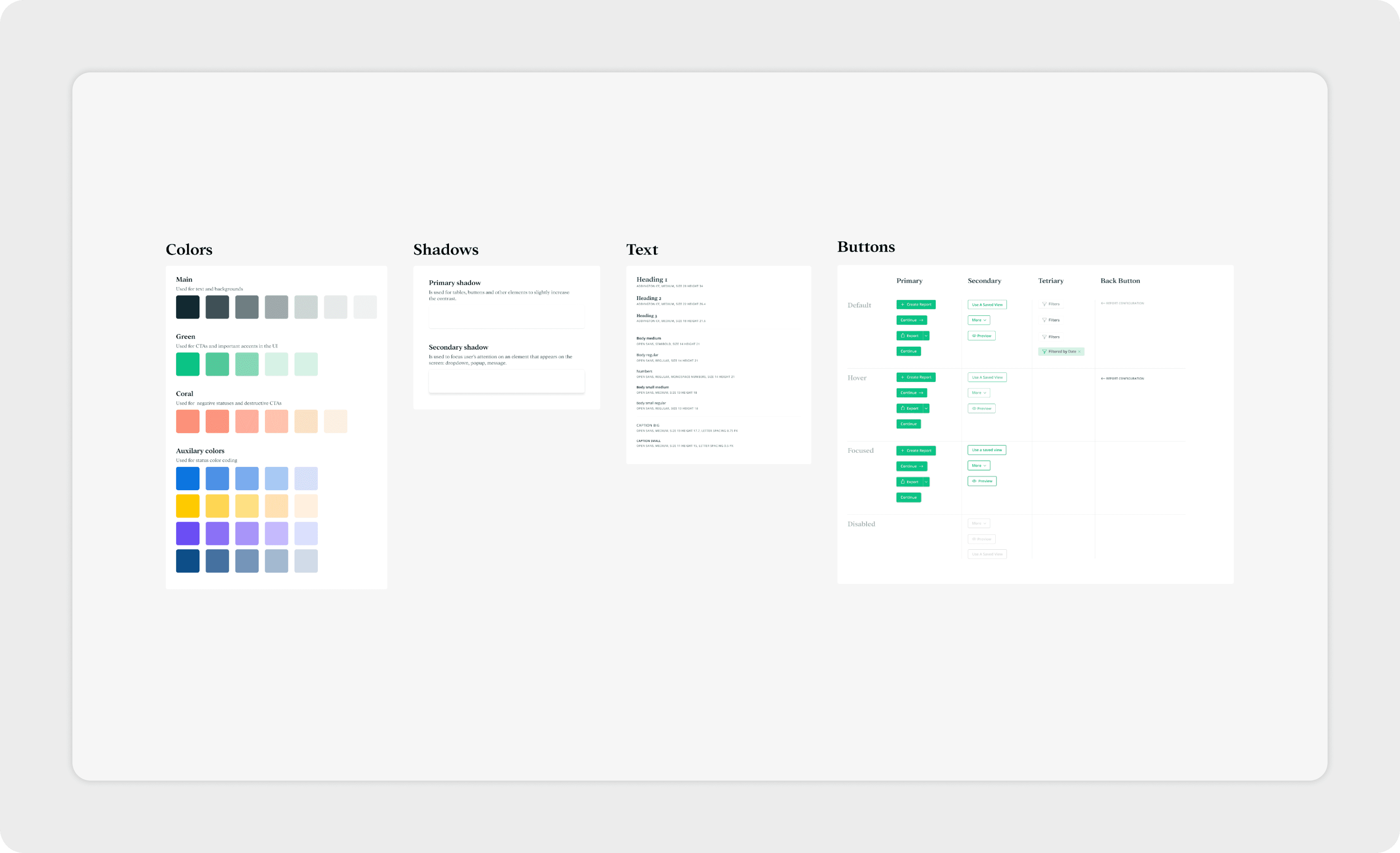
UI Kit & Documentation
HealthStream had brand guidelines in place, but many of their products had evolved without a fully unified visual style. This gave us the opportunity to refine the interface and guide the visuals in a direction that worked best for the reporting tool, while still respecting the brand’s core typography and color palette.
Together with my design partner, I created a UI Kit that structured essential components. To support smooth collaboration and handoff, we also prepared documentation to transfer files and explain usage guidelines. This ensured consistency across the redesigned tool and provided a solid foundation for future scalability and maintenance.
I appreciate the detailed and focused work you put into the project and the willingness to put in the extra mile to make sure our reporting enhancements will be impactful and well received.